Sign Up And Receive My Latest Tips & Updates!
.svg)
Fitropolis Fitness App
Fitropolis is a fun, gamified fitness-tracking app designed to motivate users through challenges, social engagement, and reward systems. This UI/UX concept centers around creating a compelling fitness experience by turning everyday workouts into interactive quests that users can complete solo or with friends.
Overview
Problem Statement
Many users struggle to stay motivated when using fitness apps, leading to inconsistent workout habits. While existing fitness apps offer tracking and goal-setting, they often lack engaging social features that foster long-term commitment. The challenge is to design a Gamification & Social Challenges feature that enhances motivation, encourages friendly competition, and builds a sense of community.
Research & Analysis
I analyzed existing apps like Nike Training Club, Strava, and Fitbit to identify strengths and gaps in their gamification systems:
- Strengths: Leaderboards, badges, and challenges drive engagement.
- Weaknesses: Some apps focus too much on competition, which may discourage beginners.
- Opportunity: Design a system that balances competition and collaboration for different user types.
To better understand user needs, I conducted a small survey:
- 65% of respondents said they lack motivation without external accountability.
- 50% prefer team-based challenges over individual ones.
- 70% want a progress tracker with rewards and streaks.
Responsibility
As the UI/UX Designer, I led the design of core app features including:
- User flows for registration, finding challenges, and check chellange tracking
- Wireframes for home page, profile page, challenge detail page and joined challenge detail
- Sitemaps to structure the app’s navigation and feature hierarchy
- Visual design of key screens with a playful and modern aesthetic
Key Features Designed
- Challenge System: Users can join step, time, or distance-based challenges, track progress, and compete with friends.
- Progress Tracker: Visual stats, streaks, and motivational indicators help users stay engaged.
- Social Engagement: Users cheer for friends, view leaderboards, and share achievements.
- Rewards & Badges: Completion earns badges and experience points to level up their profile.
- Personalized Suggestions: Custom workouts and challenges are recommended based on user behavior.
- Social Sharing: Seamless sharing of milestones to Instagram, Facebook, and other platforms.
Design Process
The design process for Fitropolis began with a deep dive into understanding user motivations and expectations around fitness tracking. I started by exploring common features across popular fitness and wellness apps, identifying opportunities to introduce more engagement through gamification and social interaction. The goal was to design a fitness experience that felt less like a chore and more like a game—fun, motivating, and socially connected. This helped establish the core pillars of the app: challenges, rewards, and community.
Once the concept was clearly defined, I mapped out detailed user flows to visualize how users would interact with each key feature. These included joining challenges, tracking progress, cheering on friends, and unlocking rewards. Mapping these flows helped ensure that the app would support smooth, intuitive user journeys—from onboarding to goal completion—without unnecessary friction.
With the flows in place, I created a comprehensive sitemap that defined the structure of the app and the relationship between its primary and secondary screens. Sections like Home, My Challenges, Profile, Rewards, Log Workout, and Daily Summary were clearly mapped out to ensure users could easily navigate the app. This sitemap also helped in organizing future expansions, such as social sharing, personalized recommendations, and free trial/subscription pages.
I then moved on to wireframing key screens using a mobile-first design approach. These low-fidelity designs focused on layout, hierarchy, and content placement, ensuring that CTAs were clear and that users could quickly find the information they needed.
For the visual design, I focused on creating a bold yet playful UI that aligned with the app’s goal of making fitness feel exciting and social. The UI design emphasized clear metrics, cheerful icons, and vibrant colors, drawing inspiration from mobile games and wellness branding. I created a design system in Figma to maintain consistency across screens, including typography, color palette, button styles, and card components.
Finally, I integrated AI-assisted tools into the process to ideate layout variations and visual treatments. I explored wireframe styles and UI compositions, which accelerated the creative process and helped validate directions quickly. These tools allowed me to maintain a balance between innovation and usability.
Overall, this project represents a full-cycle design approach—from ideation and user flow development to visual execution—focused on user motivation, habit formation, and a positive, social fitness experience.
User Flow
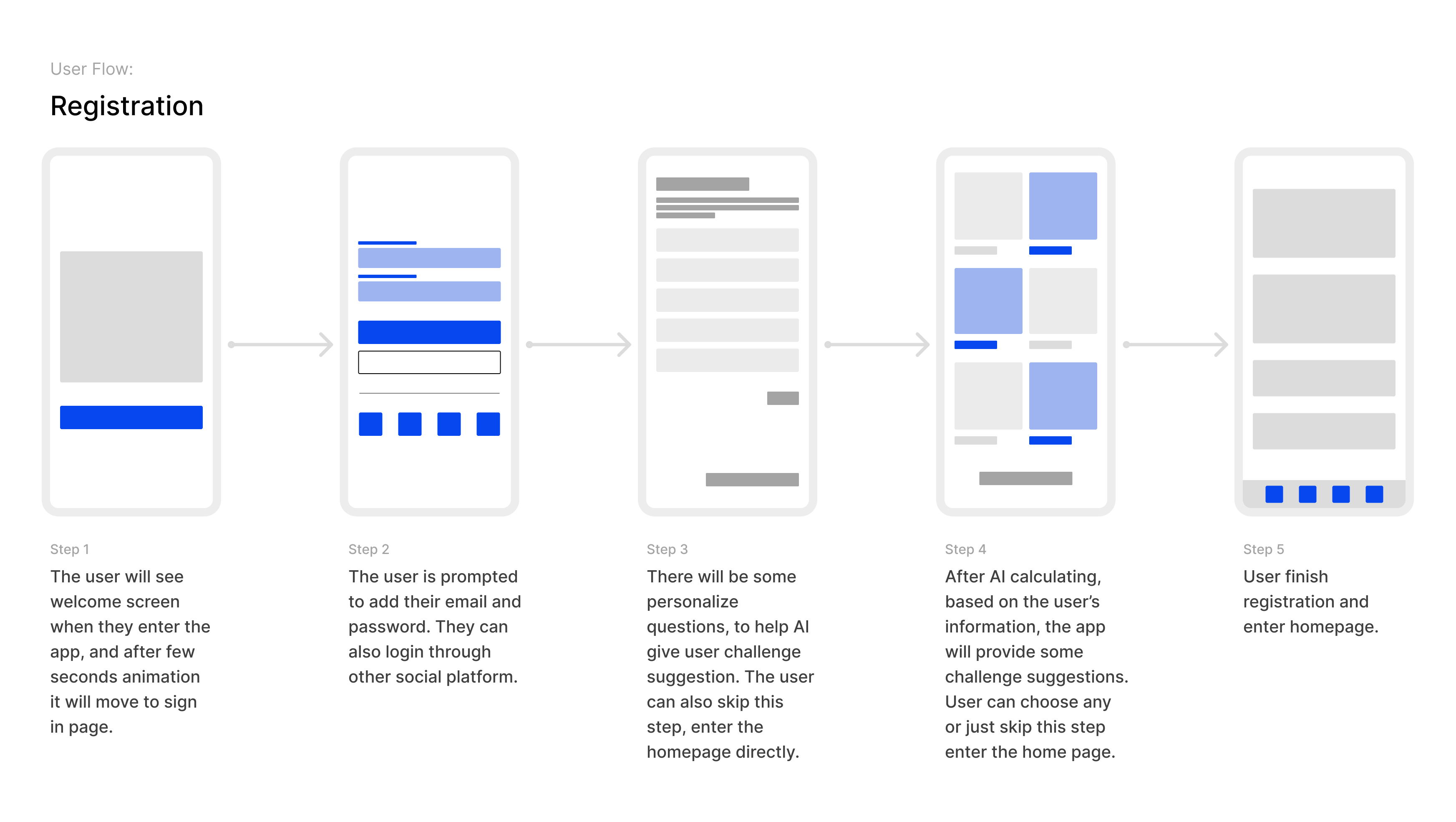
The registration flow in Fitropolis is designed to onboard users quickly while offering personalized experiences from the start. Upon opening the app, users are greeted by a welcoming splash screen that transitions smoothly to the sign-in interface through a brief animation. This first impression is crafted to feel polished and energetic, reflecting the app’s fitness-forward tone.
In the sign-in step, users are prompted to register using their email and password or choose from alternative login methods such as social media accounts for convenience. Once authenticated, they are guided to a personalization stage where the app asks a few optional onboarding questions. These questions help the app's AI system understand user preferences, fitness levels, and goals to tailor suggested challenges. However, users who prefer to skip personalization can proceed directly to the homepage.
Based on the input provided, the app's AI engine processes the data and presents a curated selection of challenge suggestions aligned with the user's interests—like step goals, strength routines, or wellness streaks. Users can choose a challenge to begin or skip the suggestions and explore the app freely.
Once this onboarding sequence is complete, the user is taken to the main homepage, where they can start engaging with all app features. This flow balances ease of entry with customization, ensuring new users feel both welcomed and supported from their first interaction.
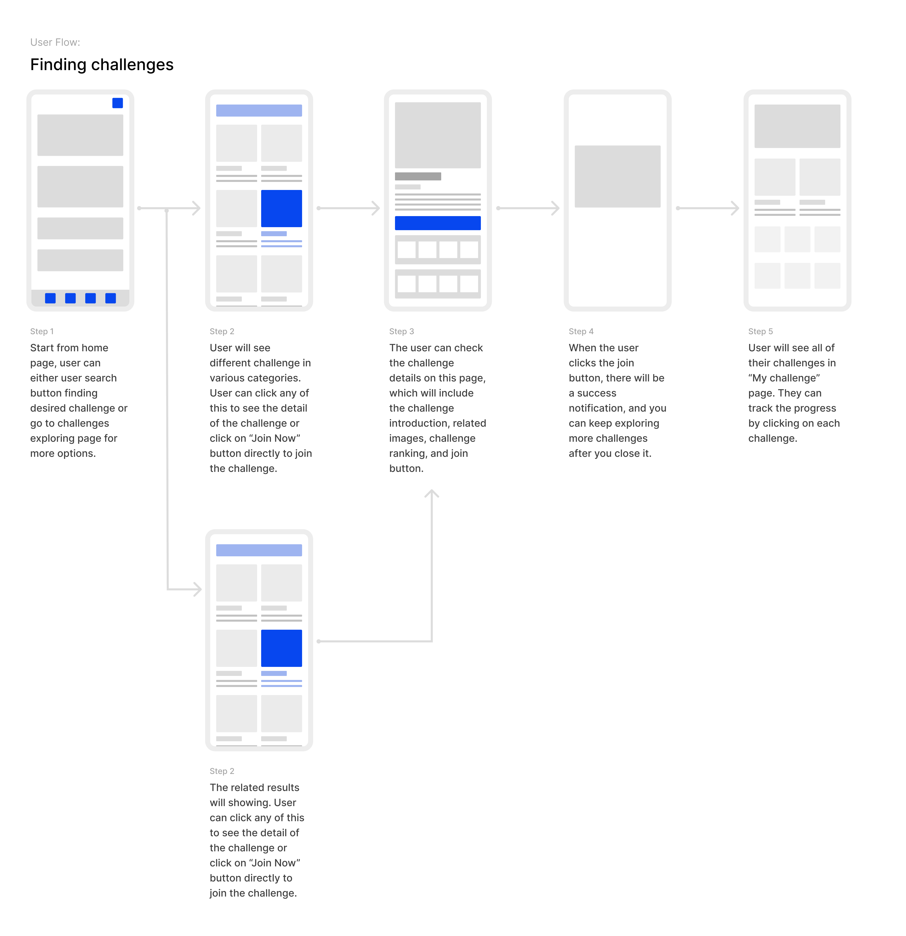
The challenge discovery flow in Fitropolis is designed to make goal-setting both intuitive and engaging. From the home page, users can either tap on the search icon to look for a specific challenge or enter the dedicated challenge exploration page to browse curated categories. This dual-entry approach accommodates both goal-oriented and exploratory users.
Once on the challenge discovery screen, users are presented with a variety of challenge cards grouped by themes such as strength, cardio, mindfulness, and more. Each card offers a preview of the challenge, including title and key metrics. Users can either click to see the full details or directly tap “Join Now” to participate.
Clicking into a challenge reveals the Challenge Detail Page, which includes an introduction, supporting visuals, challenge rankings, and a breakdown of rules or requirements. This step allows users to make informed decisions before committing. After tapping the “Join” button, users receive a confirmation notification that they’ve successfully joined the challenge. From here, they can return to browsing or go straight to their My Challenges page.
In the final step, users land on the My Challenges screen, which aggregates all their joined challenges in one place. Each listing displays current progress and invites users to dive deeper into performance tracking, social engagement, or goal completion. This structured flow ensures users remain motivated and feel in control of their fitness journey from discovery to achievement.
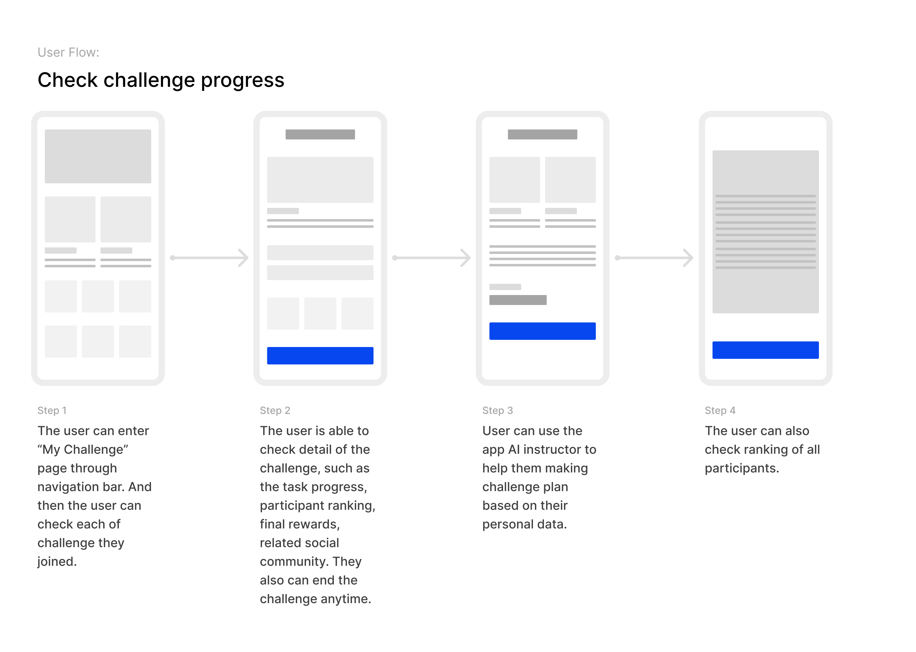
The Check Challenge Progress flow allows users to stay informed and motivated throughout their fitness journey. From the bottom navigation bar, users can access the My Challenges page, where all the challenges they’ve joined are displayed in a clean, card-based layout. This provides a quick overview of ongoing and completed activities.
By selecting a specific challenge, users are taken to a Challenge Detail View. This screen offers a comprehensive breakdown of their progress—showcasing completed tasks, remaining goals, current participant rankings, reward milestones, and links to related community groups. At this stage, users can also choose to end the challenge early if needed.
To further enhance personalization, users can activate an AI fitness instructor built into the app. This intelligent assistant evaluates the user’s current stats and recommends a tailored plan to help them stay on track. Whether they need pacing tips, exercise modifications, or encouragement, the AI adapts accordingly.
Finally, users have access to a full Ranking Page where they can view their standing among all participants. This leaderboard fosters a sense of healthy competition and accountability, while also encouraging social engagement within the app’s fitness community.
Site Map
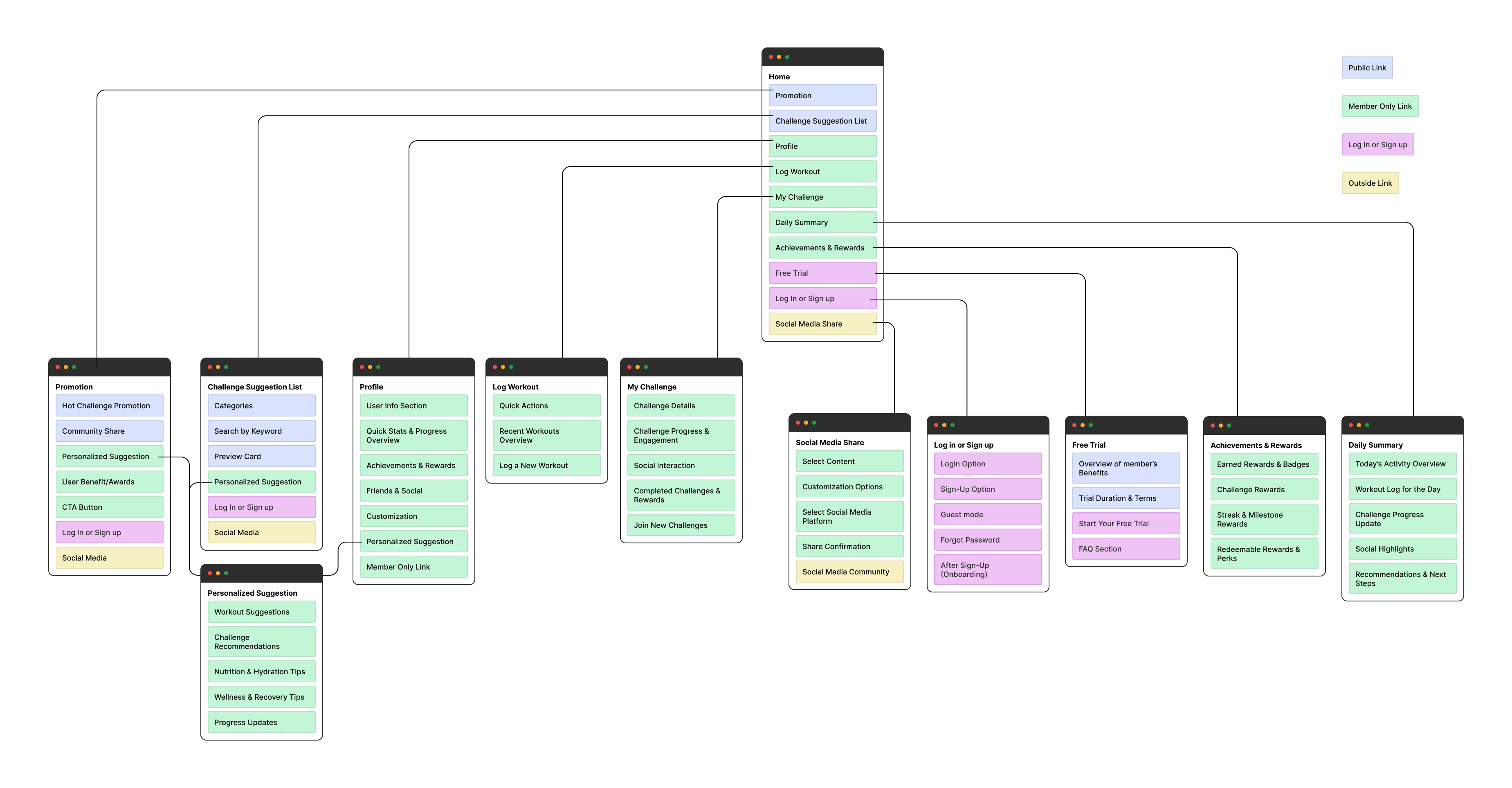
The goal of this sitemap was to define a scalable and intuitive information architecture that aligns with users' mental models, supports diverse functionality (e.g., workout tracking, challenge participation, progress monitoring), and Differentiates access levels between public and logged-in members
This sitemap outlines the structural flow and key navigation paths for a fitness or wellness app, designed to optimize user experience through personalized guidance, challenge engagement, and social interaction. The app structure is organized around a central Home hub that links to multiple core modules, each supporting distinct user goals.
Wireframes
.jpg)
As part of the UX design for a fitness challenge app, I developed low-fidelity wireframes for the most critical user journeys: Home, User Profile, Challenge Detail, and Joined Challenge Detail. These wireframes were used to validate content hierarchy, feature placement, and information accessibility before moving into high-fidelity design and prototyping.
The Home screen serves as the user’s main dashboard, designed to present personalized and actionable content at a glance. At the top, a promotional banner offers users a free trial, aiming to drive engagement and conversion. Just below, dynamic challenge recommendations appear under "Limited Offer" and "Just for You" sections, tailored to the user’s preferences and activity history. The "Daily Summary" widget summarizes essential workout stats such as calories burned and exercise duration, reinforcing user progress. Below that, the "Achievements & Rewards" section highlights earned badges and completed challenges to enhance motivation.
The User Profile screen provides a personalized overview of the user’s fitness journey. At the top, a simple user information card includes a profile image and quick access to editing personal details. Just beneath that, a "Progress Overview" section displays the user's current challenges with visual progress bars, making it easy to track completion at a glance. The screen continues with additional personalized challenge recommendations under "Just for You," reinforcing ongoing engagement. Achievements are showcased next to further highlight completed goals. At the bottom, the "Explore Community" section promotes further social interaction by allowing users to see what others are sharing or accomplishing. This screen is structured to reinforce a sense of accomplishment while encouraging users to continue participating in challenges.
The Challenge Detail screen is designed to provide comprehensive information about a specific challenge, helping users make an informed decision before joining. Key details such as challenge duration, difficulty level, and cost are displayed prominently at the top. The introduction and description offer users a brief overview, while expandable sections present additional information such as rules, requirements, and final rewards. Social proof is provided through user-generated reviews, complete with ratings and written feedback. A prominent "Join the Challenge" call-to-action button is placed to drive user conversion. Below the reviews, related challenge suggestions are displayed in a horizontal carousel, encouraging users to explore similar options. This screen prioritizes clarity, structure, and engagement by combining essential information with social validation.
The Joined Challenge Detail screen focuses on tracking the user's progress and fostering competitive motivation. At the top, a visual progress tracking graph allows users to monitor their performance over time. Below that, personalized training suggestions are presented in a horizontal scroll, helping users stay on track with adaptive workout plans. The ranking section displays the real-time leaderboard, offering a sense of competition and community involvement. Additional sections provide expandable details about the challenge, including its description, duration, rules, and rewards—similar to the pre-join screen, but available for reference post-enrollment. Lastly, the "Explore Community" module appears again to encourage users to connect with others participating in the same or similar challenges. This screen supports user retention by keeping the experience goal-oriented and socially engaging.
Visual Layout
.jpg)
This set of high-fidelity visual layouts showcases the core user interface of Fitropolis, a fitness and wellness mobile app designed to motivate users through personalized challenges, progress tracking, and community engagement. The visual design focuses on clarity, hierarchy, and user motivation, with a clean and energetic aesthetic that aligns with the active lifestyle brand. Each screen is purposefully structured to highlight critical features—such as daily goals, recommended challenges, social proof, and training analytics—while maintaining visual consistency and usability across the experience. The design leverages intuitive navigation, vibrant imagery, and clear call-to-actions to create a seamless and engaging user journey from discovery to goal completion.
At the top of homepage, a clear and motivational "Daily Goal" tracker displays progress across key health metrics such as calories burned, distance run, step count, and workout duration—presented with a visually engaging progress bar. Just below, sections like "Limited Offer," "Featured Challenges," and "Just for You" showcase personalized and timely challenge suggestions with vibrant thumbnail imagery, encouraging users to take immediate action. A horizontal rewards section adds incentive by highlighting perks like VIP passes. The navigation bar at the bottom allows seamless access to Challenges, Training, and Profile, while the central floating "+" button offers a quick-start action to log workouts or join challenges, reinforcing engagement and usability.
The profile page features a clean, vertically structured layout that balances personal identity with functional elements. At the top, a rounded profile photo and username are visually anchored against a full-width cover image, providing a personalized and engaging header. The progress overview section uses compact, horizontal cards with progress bars in distinct accent colors to visually differentiate each challenge, ensuring quick scannability. Below, the “Just For You” and “Achievements” sections are presented in modular cards with rounded corners and subtle shadows, creating visual separation while maintaining harmony in the overall grid. The bottom section highlights community interaction through tabbed content (Friends, Groups), visually represented with circular avatars and thumbnail previews to enhance user connection. The consistent use of icons, spacing, and a warm color palette reinforces the app’s motivational tone while maintaining an organized and approachable interface.
In the challenge detail page, a prominent header image spans the top, immediately immersing users with the challenge theme and setting a dynamic tone. Below, key information such as age group, difficulty level, and duration is displayed using pill-shaped badges, providing quick visual cues. The challenge title and pricing are bold and centered for immediate recognition, followed by a structured block of content sections—Introduction, Duration, Type, Level, Rules & Requirements, and Rewards—each marked by clean dividers for easy navigation. The "Join the Challenge" button stands out in a bright accent color, reinforcing its call-to-action prominence. The reviews section features user avatars and rating stars arranged in stacked cards with ample padding, giving the page a social and credible feel. At the bottom, horizontally scrollable recommendation cards maintain layout consistency while encouraging further exploration. Overall, the design balances content density with white space, creating a user-friendly and visually engaging experience.
The joined training detail page presents a clean, structured layout that supports both data visualization and interactive elements. At the top, a header section with a striking visual and basic challenge info—age, level, and duration—establishes context at a glance. Directly beneath, a compact progress chart with subtle grid lines and orange data points provides a clear visual snapshot of the user’s performance over the past week. This is followed by a horizontally scrollable training suggestion section, designed with thumbnail images and concise titles that maintain visual interest while guiding user navigation. The ranking component uses a numbered list layout with avatars and progress bars, making comparison among participants intuitive and engaging. Below, expandable sections like Description and Rules are housed in accordion-style dropdowns, keeping the interface tidy while allowing in-depth exploration. The reviews module and community section round off the page, using clean card-based layouts with user avatars, icons, and consistent spacing. The use of a cohesive orange accent throughout guides attention and reinforces brand identity, while the balanced padding and alignment ensure visual harmony across the screen.
Mockup
.jpg)
.jpg)
.jpg)
.jpg)

